

When it comes to website navigation, every click, scroll, and link counts. A seamless journey leads to a positive user experience and in turn higher conversions. However, for large websites, this can often be a challenge. There are navigation best practices we can follow to help set a business up for success and provide users with a more intuitive experience.
A Clear Menu Structure
First up, we need to look at the website menu. This should be more than just a collection of links. It needs to provide web visitors with a roadmap that is user-friendly. The menu layout is key and should be clear and somewhat predictable, with items logically organized, reflecting the natural flow of information. Simplicity works best here, and each menu item should have a distinct purpose to avoid overwhelming users with unnecessary options. Consistency is also important as businesses should maintain the same menu placement throughout the web experience which provides a familiar anchor for users and reduces the chance of confusion. A well-structured menu allows not only seamless navigation but also contributes to better engagement and conversions by helping users find what they need with ease.
Drop-down menus
When a user hovers or clicks on a main menu item, a drop-down menu will often appear, providing a pathway to additional levels of the site, forming a hierarchy. These drop-down menus are often used to categorise group related links, making it easier for users to find specific pieces of content without cluttering the navigation bar. It is best practice to keep them concise with clear labels, and easily clickable areas. Creating a tiered structure can be particularly useful for fighting clutter and grouping related items under main categories. Visual cues such as arrows or icons can be used to better highlight these dropdowns.
Breadcrumbs and Back Buttons
Breadcrumbs and back buttons are useful as they provide web users with another navigation option. A breadcrumb is a trail of links that reflect a user’s path and gives them a clear roadmap, helping them understand where they sit within the site’s hierarchy. It also allows for easy backtracking. Back buttons are important as they offer a faster return to the previous page or step in the journey. This is a convenience that users appreciate as they can easily retrace their steps and don’t need to rely on the browser navigation to do so. Together, breadcrumbs and back buttons provide a more user-friendly environment, reducing friction and improving the usability of the website.
Search Functionality
A robust on-site search engine is another element that positively impacts website navigation. By implementing a search function that includes filters and predictive search, businesses can elevate user satisfaction, getting users to their desired content more quickly. Predictive search anticipates the users’ queries, providing them with instant suggestions and in turn streamlining their search process. All these search features together contribute to an intuitive and accelerated navigation experience, helping users find what they are looking for with ease. The optimizing and fine-tuning of these search engines is also important to consider, as users increasingly rely on search functionality.
Call-to-Action (CTA) Placements
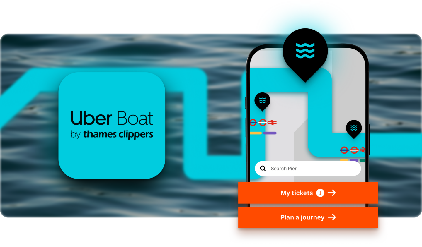
Strategically placing call-to-action (CTA) buttons within a website’s navigation results in a symbiotic relationship that guides web visitors through the digital journey and drives better conversions. When CTAs are well-positioned, they enhance engagement and prompt actions at key points in the navigation flow. It’s especially important to implement CTAs where they align with both user intent and content relevance. Placing them at the end of information sections or close to navigation points helps to ensure users encounter them naturally, creating a user-centric approach. It’s a practice of balancing visibility without overwhelming the navigation structures, steering users towards the actions we want them to take, while also optimizing the overall user experience.
User Testing and Feedback
Effective website navigation relies on continuous user testing and feedback. Usability testing helps you understand how users interact with the navigation in place and can identify any pain points or areas for improvement. User feedback can be gathered through surveys, analytics, and heatmaps, all providing valuable insights into user challenges and preferences. Incorporating this feedback allows for iterative improvements to the navigation structure, making sure it aligns with user expectations. Regular usability testing is vital for the sustained success of any site.
From clear menu structures to strategic CTAs, each element plays a contributing factor in enhancing satisfaction, engagement and conversions. The interconnected design is not simply for convenience, but a powerful tool shaping users’ digital journeys. By prioritising intuitive layouts, responsive designs and user-friendly features, businesses can enjoy more optimal results from their web strategy.


Connected commerce that scales. We design, engineer, and enable seamless ecosystems that connect channels, people, and performance, and convert across every touchpoint.
Learn more