

Every form has its purpose, right? To get a user from A to B in the easiest way whilst avoiding the all too familiar problem of abandonment.
First impressions really do count. People will form their first impressions in just 50 milliseconds so it’s important to get both the UI and UX working together seamlessly. The objective is to create and design an interface that is simple, clean and clear to use. On first look, users will scan the form and decide how much effort is going to be required to complete it.
It may sound a tad vain, but we’re all inclined to spend longer looking at something that’s beautiful. Who wants to fill out an overcomplicated form that looks horrible? Not us. As designers and developers all Interfaces we design take learnings from our own experiences, not just as creators, but also as users. Here are a few key considerations we look to use as a rule.
Single or Multistep?
Should you use a single step or multiple step form? A good question that all depends on the specifics.
Single step forms can look intimidating, especially if there are a lot of questions to answer, but if it’s fairly light then this is the way to go. If it has multiple sections, however, then splitting and grouping data into logical sections is a better approach, for the following reasons:
Keep it short
It may seem obvious but short forms outperform long forms. Removing all non-essential fields will help to prevent abandonments and speed up the form process.
Order of content
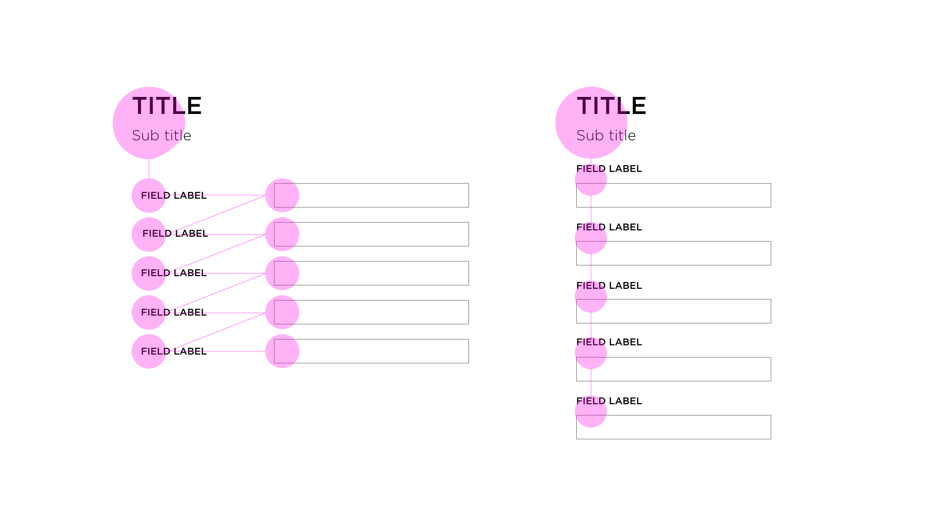
Using vertical alignment for labels and fields cuts the amount of ‘visual fixations’ you need. Using top-left alignment or inline alignment of labels increases completion time.
Use clear messaging
Using hints to help explain why a question is necessary will make the user feel more at ease in supplying the data. When an error is found, clearly show where the issue is so users don’t have to spend time scrolling to find it.
By using supportive text, i.e. “Please enter your telephone number”, rather than just relying on changing the colour of the text or a field, you make the life of the user much easier. In addition, there are approximately 3 million colour blind (colour vision deficiency, CVD) people in Britain, so accessibility issues have to be considered.
Conditional logic
Conditional logic makes the process feel more tailored. If “X” has been selected then show “Y” and remove any unnecessary questions that are then irrelevant thereafter. By reducing unnecessary questions we prevent people from becoming confused, thus reducing abandonment.
Mobile optimisation
As more and more users use their mobiles to browse the web, we can only assume that the number of users using their phones to fill out forms is also increasing. We have an opportunity here, therefore, to enhance user experience using the technology inbuilt within mobile devices. Some ways of optimising form design for mobiles include using the camera to capture card ID and using the correct keyboards depending on the fields for text & numbers.
Still got your attention?
As humans our brains process imagery quicker than they do text, so where there are clear decisions to make we should visualise content with the use of images and icons.
Manners cost nothing
You’ve made it! The effort has paid off and the final link has been clicked. Now in the spirit of being a nice person, a thank you is always a nice way to sign off. After all, who doesn’t appreciate politeness?


Connected commerce that scales. We design, engineer, and enable seamless ecosystems that connect channels, people, and performance, and convert across every touchpoint.
Learn more