With more people managing their healthcare online, an accessible and efficient web experience is critical – and never more so than as we battle cold and flu season. As patient demand for healthcare information and support approaches its annual peak, now is the time to optimise, and fast.
To deliver the online experience patients have come to expect and deserve, healthcare sites must follow important digital strategy principles and prioritise intuitive design. Our experience in crafting digital strategies for healthcare clients and other organisations shows the best sites are built on two fundamentals. The first is an understanding of what fosters trust like easy access to information and a focus on education and transparency. The second is a commitment to centering around the audience your site serves, and recognizing that a one-size-fits-all solution likely does not meet their unique needs.
By combining these elements with key design principles, you can elevate the healthcare digital experience beyond basic functionality to build patient confidence – an underlying driver of engagement and satisfaction.
The visitor’s perspective should always be prioritised within a site’s structure. Build your website and taxonomy around the patient, not your internal organization. Visitors navigate based on individual needs. Whether they browse by symptom, condition or treatment options, ensure a clear entry point and path for them to find what they need.
Site search also plays a big role in page findability. A search function that doesn’t yield relevant results can damage credibility and make users question if you provide the services they need. Search with natural language processing (NLP) helps interpret misspelled medical terms and redirects to alternative search results, improving the user experience.
Don’t forget about other people landing on your healthcare site. Aside from existing and new patients, there are many other audiences to consider, including families, prospective talent, researchers, donors, or your employees.
Your site should speak to all these users and provide them the information they need. A prominent and clear call to action (CTA) for the careers section, for instance, helps nurses and doctors find open job roles quickly without having to sift through patient-related content first.
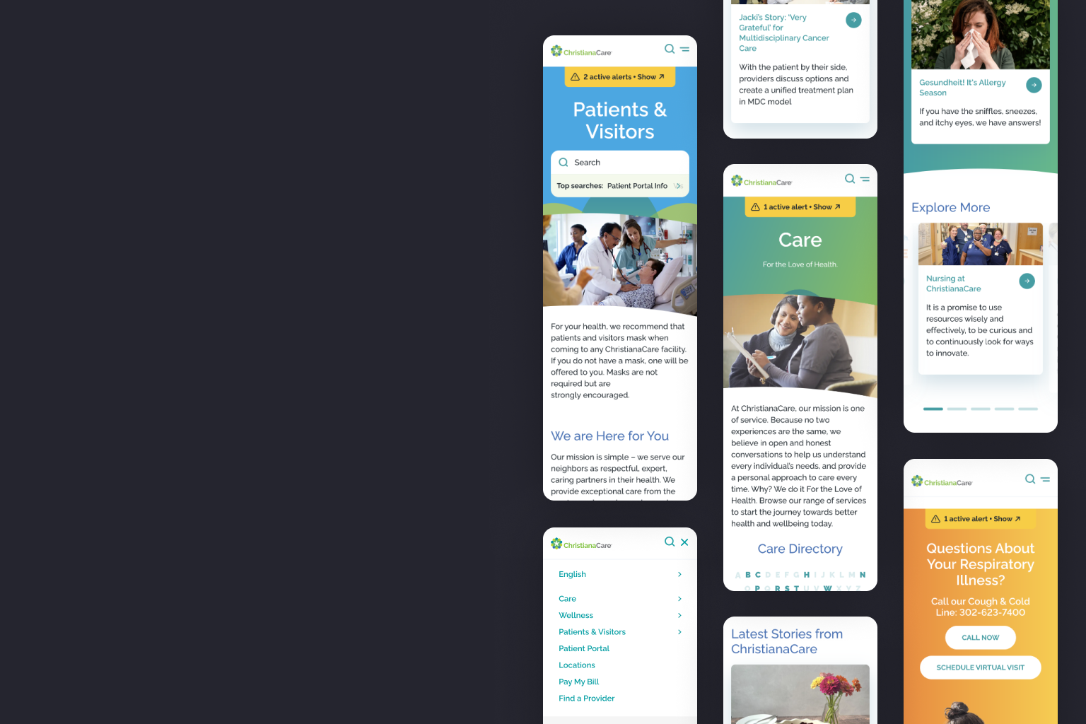
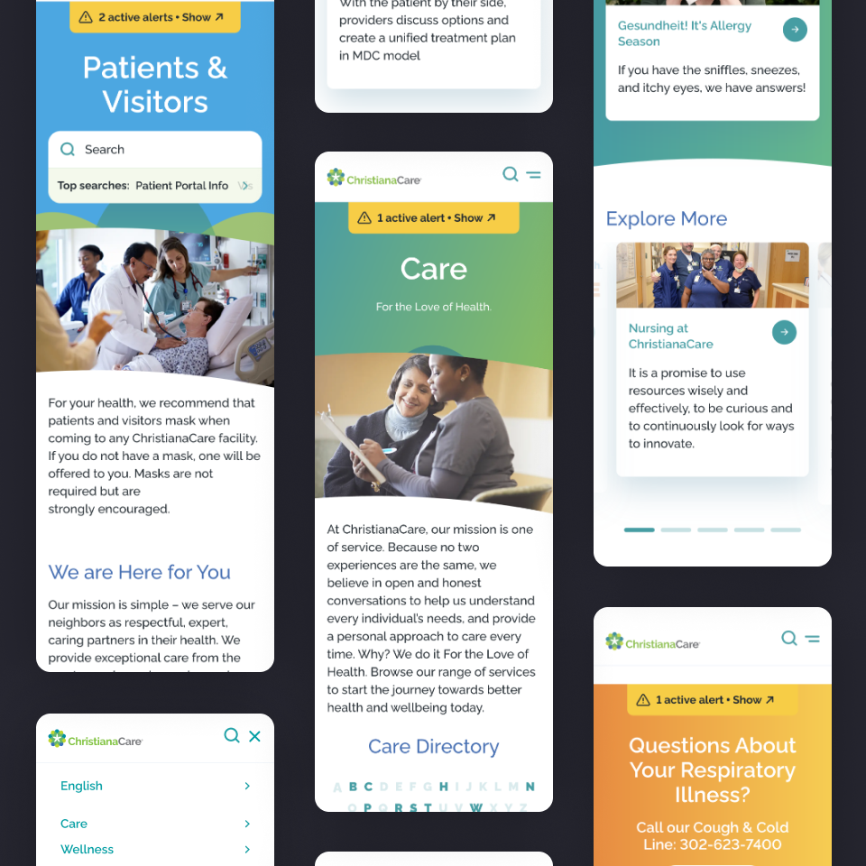
Carefully consider imagery and graphics. Image choices should correspond with the content and resonate with and reflect your audience – helping to foster trust and inclusivity. Avoid over-reliance on generic stock photos as they can come across as inauthentic. Icons can also be an effective tool to communicate complex or dense information.
With patients increasingly accessing healthcare on the go, always take a mobile-first approach. Slow-loading pages, clunky navigation or hidden menus can drive mobile users away. While you may have dynamic features like autoplay or pop ups on the desktop experience, consider simplifying for mobile.
One of the most critical components of a task-oriented site is clear and consistent CTAs. Whether visitors are locating a clinic, logging into a patient portal or paying bills, they should be able to complete common tasks efficiently. Priority CTAs should be easy to spot and follow from the main menu or across page heroes.
Consistency in button styles and link behaviours also minimises confusion. Inconsistent or flashy buttons – with varied colours, a mix of sizes and confusing hover effects – make it difficult for a user to understand what to click on next.
It’s also important to prioritise clean and well organised design. Too many colours or dense layouts can overwhelm users. Stick to a simple colour palette – typically two or three – and include white space so it’s easy to scan and digest content.
The wrong colour choice can amplify negative emotions, especially when visitors may already be navigating stressful medical situations. In our experience, recommended colours for the health space are blue,often associated with trust and calmness, and green, representative of healing, balance and harmony.
An effortless site journey is important in healthcare because the audience is diverse – they may not be tech-savvy or familiar with medical terms. Visitors could already be weary or overwhelmed, and just want to find answers to their health challenges quickly.
Simplified navigation, clickable breadcrumbs and an uncluttered main menu allows visitors to move through the site smoothly. Organising content logically with headers and distinct sections also make it easier to understand information and the next steps in the journey.
Don’t overcomplicate forms and logins, either. Healthcare websites should not prompt users to log in multiple times or force them through long, confusing forms. Minimise the number of question fields and consider embedding forms directly on the page instead of linking out.
Finally, collecting personal data is serious and should be treated with care – always use regulation-compliant solutions and be transparent with why you need this information.
While every healthcare organisation has unique goals and challenges, embracing these design principles, combined with a human-centered approach, can elevate a site experience beyond basic functionality to build patient confidence. The result? More engagement, increased patient trust, and most importantly, healthier communities.
Our dedicated team dives deep, delivering relentless value and aligning digital solutions with your goals in a way that guarantees success
Learn more