
London has spent decades arguing about how to expand its transport network. Meanwhile, the oldest one we have was running under capacity.
The Thames moved more people than any road in London for most of the city’s history. By 2024 it was carrying a fraction of what it could, and the reason wasn’t capacity, frequency, sustainability or price. It was legibility. Most Londoners couldn’t tell you where their nearest pier is. Fewer could tell you about where services go, when, or how long it takes. The river was hiding in plain sight.
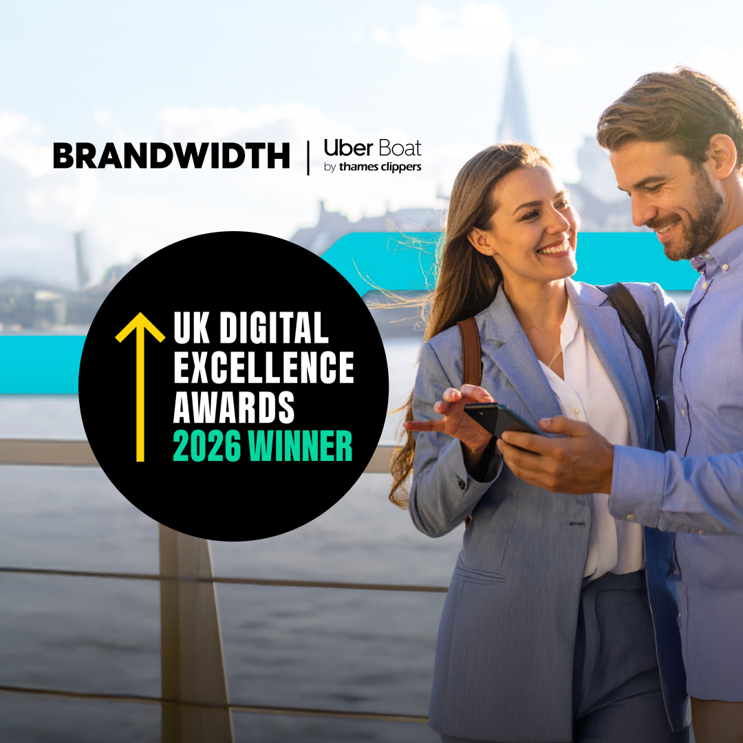
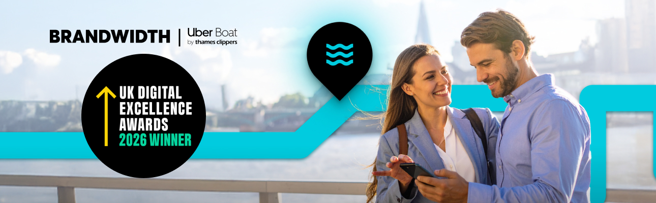
That’s a UX problem, not an infrastructure one. And it’s the most interesting thing about the work we did with Uber Boat by Thames Clippers (UBTC), recently a double winner at the UK Digital Excellence Awards 2026, taking both Standout UX and Standout App.
Transport policy in this country is obsessed with building new things. New tunnels, new lines, new stations, new bridges. It’s the kind of work that gets ribbons cut and headlines written. But there’s a parallel conversation that gets almost no airtime: how much of the network we already have is being under-used because it isn’t legible to the public.
UBTC operates 24 piers across one of the most extensive commuter river networks in Europe. The boats are high-frequency, scenic, low-emission, and increasingly run on hybrid and hydrogen-powered vessels. The service exists. The capacity exists. The route map covers every pier you’d actually want.
What didn’t exist was a passenger’s confidence that any of it would work. People were stitching journeys together from static timetables, websites, and signage that didn’t reconcile with what was happening on the river in real time. So they took the Tube. Or the bus. Or a cab.
The problem wasn’t a missing service. It was a missing layer between the service and the passenger.
The strategic call we made early was to make the river legible. Visible. Trustable. Predictable enough that a commuter would default to it and a tourist would explore it without anxiety. That changed everything about how we designed it.
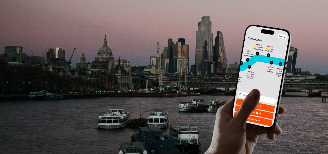
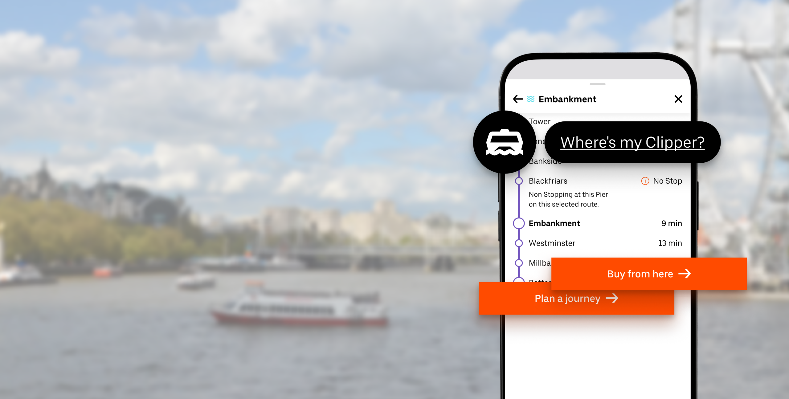
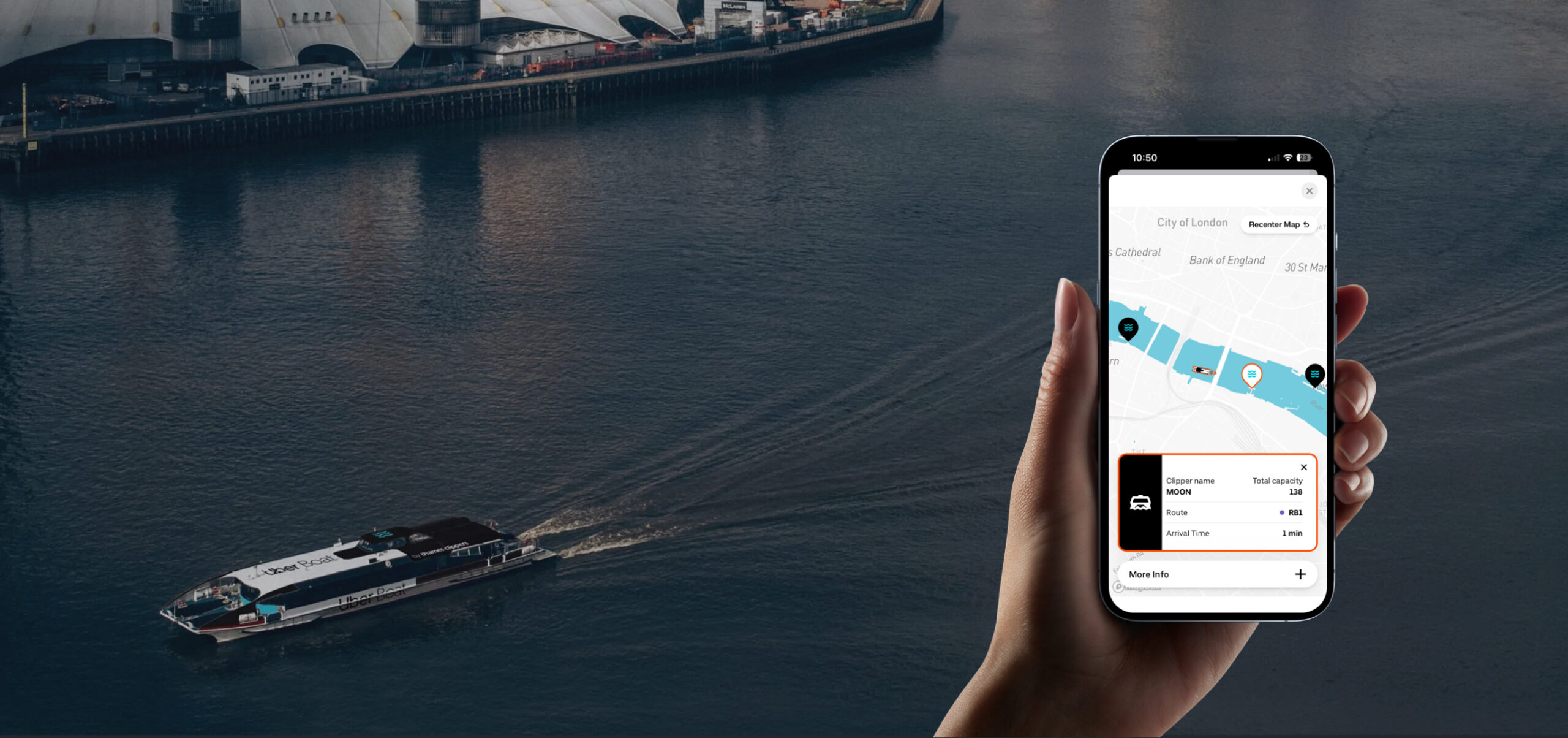
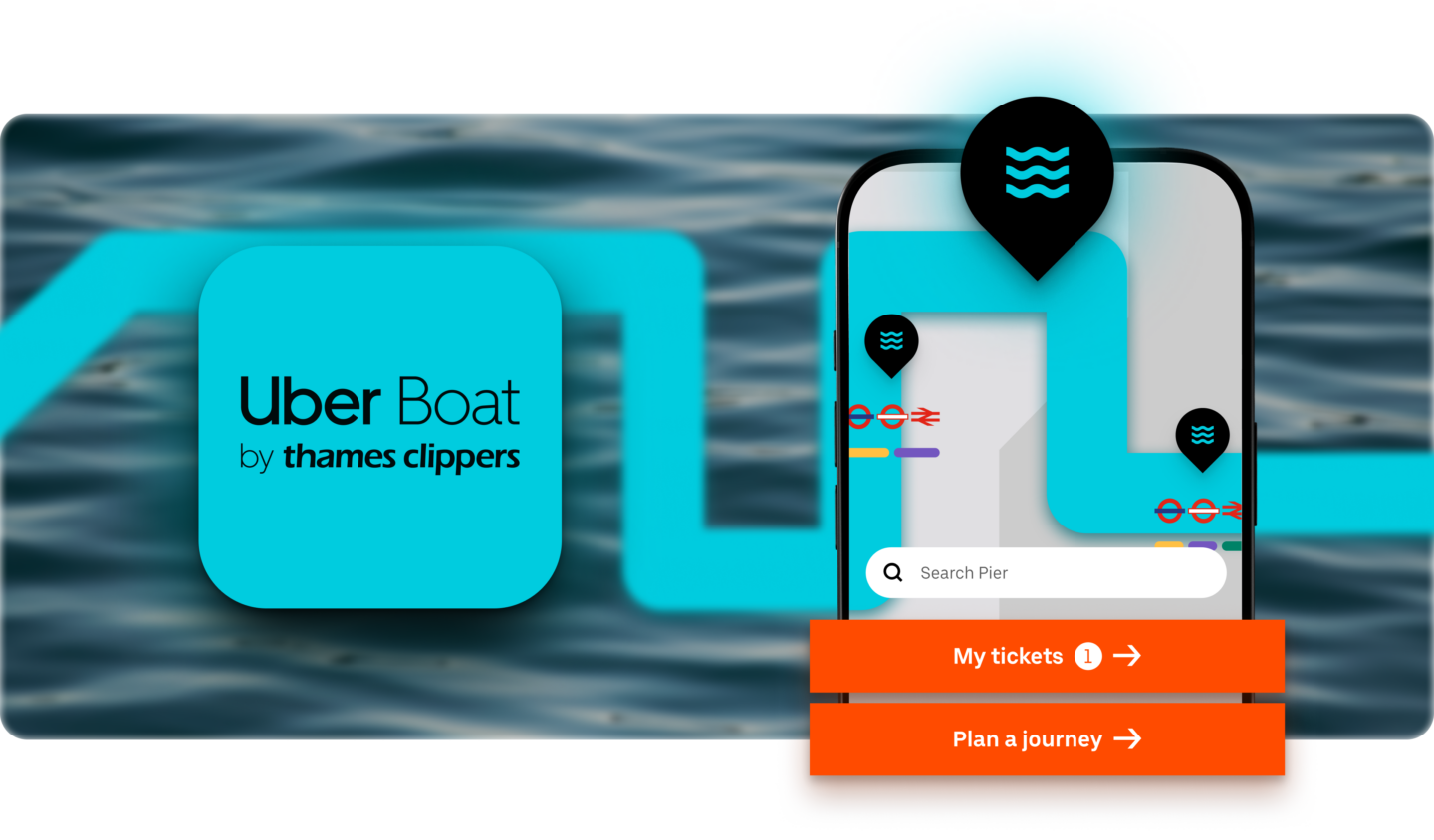
We built the data layer first, before any UI work began. Tracking a boat is harder than tracking a car: there are no lanes, tides and currents shift constantly, and GPS is less reliable on water, so we integrated multiple operational data sources into one coherent live view. Only once that foundation was solid did we layer the experience on top: a journey planner with real-time schedules and an interactive map, “Where’s My Clipper” live tracking with a traffic-light capacity indicator, in-app ticketing via Apple and Google Pay, and the integrated River Guide for sightseers.
Two mental models, one screen. Commuters need speed and reliability. Tourists need clarity and wonder. Most transport apps pick one and fail the other. We had to do both.
The case study makes the design challenge sound elegant. It wasn’t. It was brutal.
A commuter wants speed, reliability, and the next departure from the nearest pier. A tourist wants clarity, orientation, landmarks, and a sense of where they are in London. Both groups open the same app. Most of them don’t know which group they belong to until they’ve used it for a minute.
Cramming both mental models onto one phone screen, without one audience overwhelming the other, took longer and more iterations than any of us expected. The polished case study makes it sound like a design decision. It was actually months of compromises, kills, redesigns and small surrenders. We’re happy with where it landed. We could write a separate piece on the things that didn’t make it.
The behaviour change after launch is the part we find most telling, not because the numbers are big (they are), but because they tell you what people actually wanted from the river all along.
Almost a fifth of everything passengers do in the app has nothing to do with buying a ticket. That’s the legibility dividend. Once people can see the river, they engage with it differently; and they come back.
UBTC also has, for the first time, real behavioural data on how the network is actually used: which piers, which routes, which times, which passenger types. That data is now starting to inform service planning, marketing and longer-term commercial decisions. The app didn’t just unlock the river for passengers. It unlocked the river for the operator.
There’s a wider point here, and it’s the one we’d argue most strongly for. Cities are full of latent infrastructure that’s under-used because the digital layer never caught up. River networks. Cycle hire. Park-and-ride. Coach networks. Late-night services. Out-of-town venues. Heritage rail. The list is long.
In the next few years, AI assistants will plan more and more journeys on people’s behalf. The networks that get chosen will be the ones with structured, real-time, trustworthy data, the ones that have done the boring work of making themselves legible. The ones that haven’t will be invisible, regardless of how good the underlying service is.
The future of urban transport probably isn’t more vehicles. It’s making the ones we already have findable, trustable and bookable by humans and increasingly by the machines acting on their behalf.
We’re proud the work has been recognised at the UK Digital Excellence Awards. But the prize we care about is what’s already happening on the river: more people, choosing it, on purpose, because they can finally see it.
Want to know more or talk about how this could work for you? Contact Us.
Connected commerce that scales. We design, engineer, and enable seamless ecosystems that connect channels, people, and performance, and convert across every touchpoint.
Learn more