

London Design Festival 2019 saw the award-winning graphic designer Sascha Lobe partner with The Design Museum – and I was lucky enough to get a ticket to his lecture.
Sascha is a well-revered typographer and graphic designer, recently joining Pentagram as a partner. He is extremely proud of the Bauhaus influence in his work and used the lecture as an opportunity to celebrate the centenary of the launch of the Bauhaus school; giving us a brief history lesson of how it developed and grew, before taking us through some of his work.
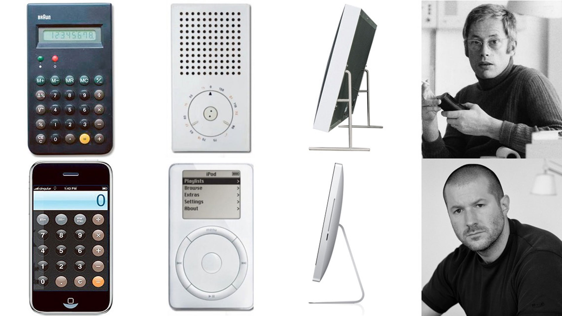
Bauhaus influence can be seen everywhere. Apple’s products are clearly inspired by the Bauhaus via the work of Braun in the 50s – the iMac, with its pivoted stand, and the iPod click wheel are two very clear examples. And, as Sascha argued, Google’s recent move from a serif logo to sans serif was equally Bauhaus influenced.

This leads on to an interesting discussion surrounding what is and isn’t Bauhaus in today’s design. While less obviously and directly taken from the rules of the school, it is clear that Bauhaus thinking is prevalent in much of the product, furniture and graphic design around us. The rules and the thinking, both so unique and different for their time, have paved the way for everything that has come after.
At the lecture, there was some debate from Sascha with the audience as to whether something as ground-breaking as the thinking that came out of the Bauhaus school could ever happen again. But it was the seclusion of the school, in the German countryside, that helped foster this innovative thinking. Today we are constantly bombarded with visual stimuli, good and bad, and there is no way that any art students could ever achieve the same level of disconnect – however much art universities try.
This is not necessarily a bad thing. Designers today have so much inspiration available to draw from, and in turn are creating new trends and styles that are henceforth influencing the future generations. Periods of design and the stylings they create may not be as distinct as they used to be. This is partially to do with speed; as the technology we design on and the mediums we design for innovate continually, at an ever-increasing rate, so do the trends and styles that come and go, each inspiring and mutating each other.
As one man in the audience said: “if we want to know what design is going to be in 7 years time, we should be looking at what students are doing in college today”.

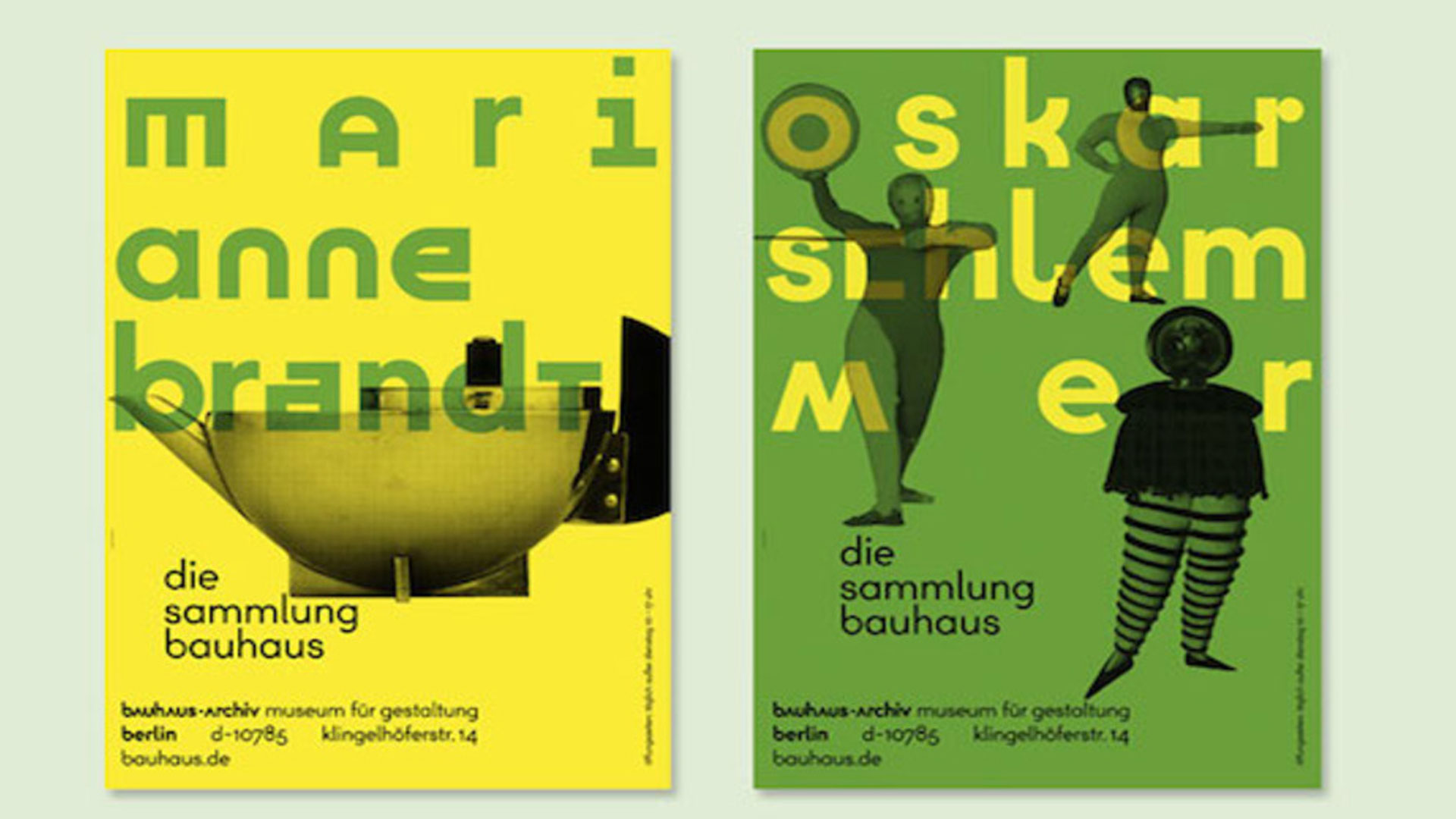
You can see Sascha’s work in the Beazley’s Designs of Year exhibition at the Design Museum. He has also been commissioned by the museum to design a special road crossing on Kensington High Street with his Bauhaus inspired typography. While most the lettering is deliberately illegible, simply playing with form, he wanted to celebrate important female figures in the Bauhaus are rarely spoken about, and he has intertwined their names in yellow within the design of the crossing.


Connected commerce that scales. We design, engineer, and enable seamless ecosystems that connect channels, people, and performance, and convert across every touchpoint.
Learn more