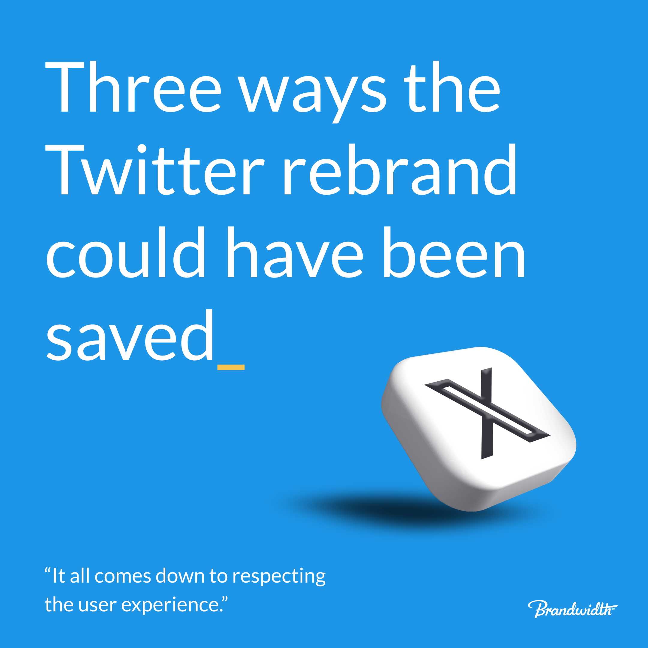


Since Elon Musk rebranded Twitter to X last month, agencies, marketers and industry publications alike have been discussing the change, with the general sentiment being one of confusion at Musk’s seemingly haphazard execution. While all publicity may be good publicity, we can’t help but think that the social media CEO is wishing he’d gone about things a little differently.
So, how could Musk have ensured that things went a little smoother? It all comes down to respecting user experience:
A/B Testing
In an age where A/B testing is a common practice to fine-tune user interfaces, it’s surprising how the rebrand seemed to disregard this approach. Unlike Facebook’s user-friendly method of grouping users to test new interfaces and homepage layouts, the transition from Twitter to X was a sweeping change imposed on everyone. This disregard for individual and group user habits and preferences is a major blow to the user-centric approach that most successful platforms strive for.
Keep the Experience Consistent
One of the cardinal rules of branding is consistency, so the disjointed implementation of X fragments the brand identity and disorients users.
The first app update following the rebrand announcement left some users seeing the new ‘X’ icon alongside the Twitter name. Similarly, users are still able to ‘retweet’ posts and the ‘post’ button remains the same iconic blue that has Twitter used for years.
What’s also interesting is that the URL remains unchanged at www.twitter.com, despite earlier reports that Elon Musk had acquired the premium domain name – www.x.com – years ago.
Brands that succeed in establishing a strong digital presence ensure that their users have a seamless experience from the outset. The disjointed transition from Twitter to X has, regrettably, broken this essential link.
Consider the Timing
You can’t control what your competitors do, but you can control your reaction to it, and Musk would have done well to remember that following Meta’s launch of Threads – their Twitter-esque platform, with striking monochrome branding.
Whether the black and white rebrand was already in the works, or if it was a hurried reaction to Threads isn’t known, but the striking similarity between the app icons can easily lead to confusion, especially when users are casually scrolling through their smartphones.
While there’s far more to user experience than these three examples, Musk’s blatant disregard for these basic principles is at the core of his failure. With a bit of consideration, patience, and respect for users, the rebrand could have been far more successful.


Connected commerce that scales. We design, engineer, and enable seamless ecosystems that connect channels, people, and performance, and convert across every touchpoint.
Learn more